Aide Canada
Branding-
ROLE
Interim design director
CLIENT
Aide Canada
![]()
Branding and visual identity for a Canadian federal program created for the Autism spectrum disorders and Intellectual disability communities.
Aide Canada is an extension of the research done by the Health Design Lab at Emily Carr University. In early 2019 experts from across Canada came together to launch the Aide Canada initiative, thus beginning the development of a socially innovative digital ‘one-stop-shop’ for the Autism spectrum disorders (ASDs) and Intellectual disabilities (IDs) communities.

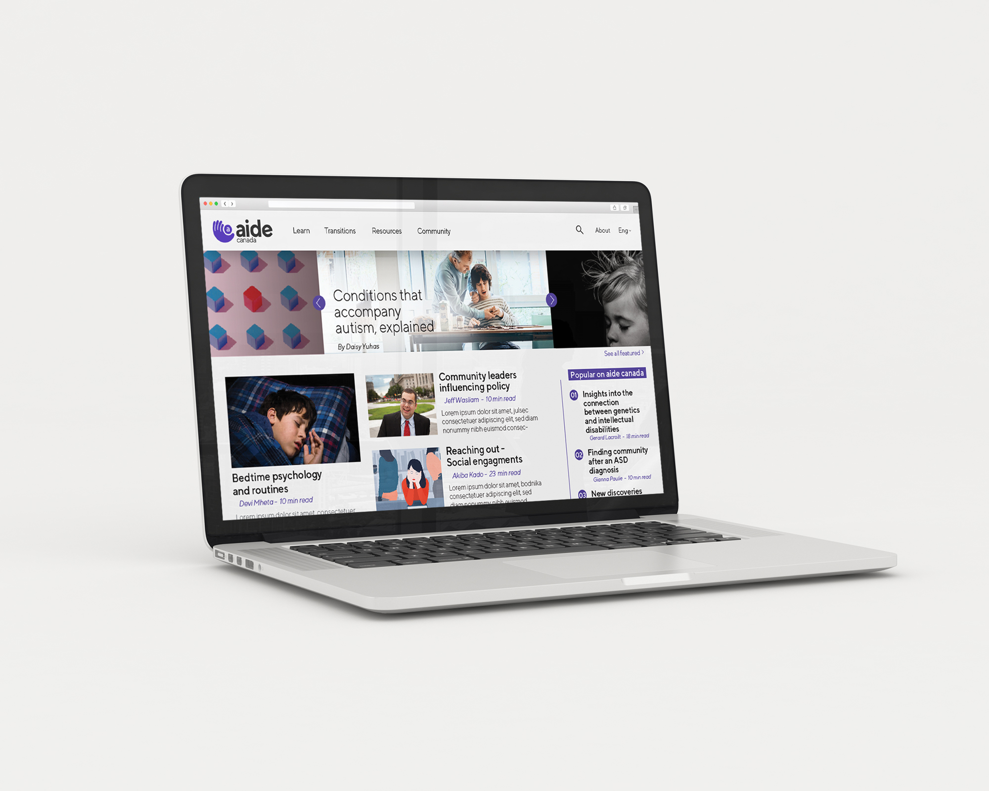
Visual identity
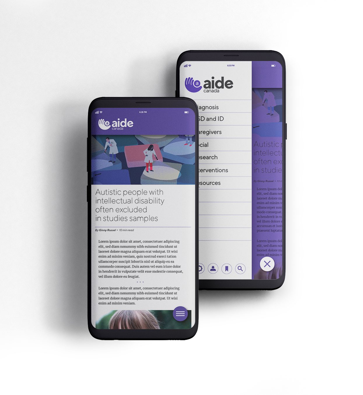
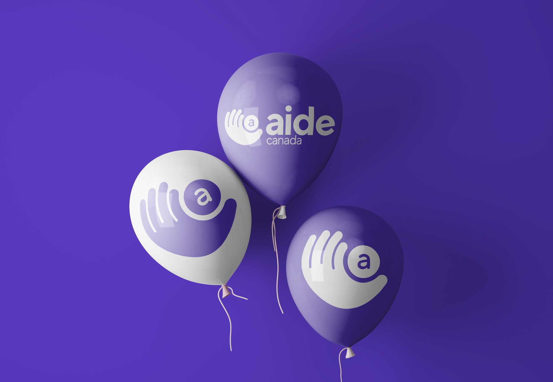
The logo
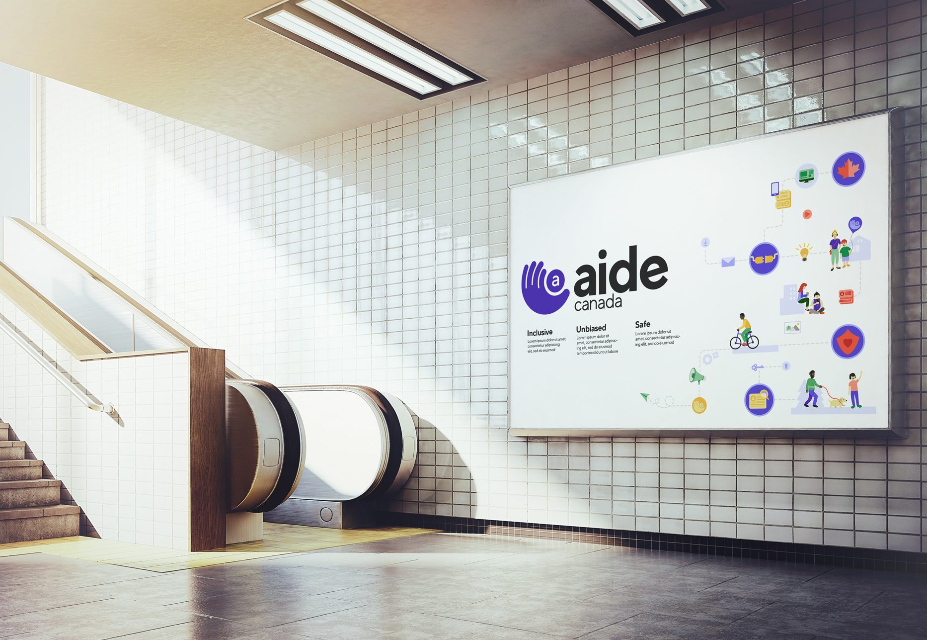
This visual identity conveys the spirit of an organization poised to change the way families and individuals within the ASDs and ID community connect, research and resources across Canada. The curvilinear logo conveys feelings of continued support and inclusivity. The hand cradles the circle in which the brand’s monogram sits evoking a humanist and playful attitude. It is clean and straightforward yet unique enough to become a visual beacon for the organization as it grows and changes with its community.

Colours
Aide Canada’s palette is bright, cheerful and jovial; the colours are a reflection their core values. They are intended to be playful but not overly childish. The primary colour is purple, strong and striking with five accent colours to support it. In addition, 18 supplementary colours were defined in the branding and visual identity guideline booklet to add depth to illustrations and other visual components.

Typography
The primary typeface used by Aide is TT Norms, which was thoughtfully designed by the TypeType foundry. The wordmark is in lowercase with the ‘e’ in the wordmark on a 10 degree tilt that corresponds with the ‘a’. This slight adjustment gives the wordmark a more open and friendly feel essential to the brand’s voice and tone.

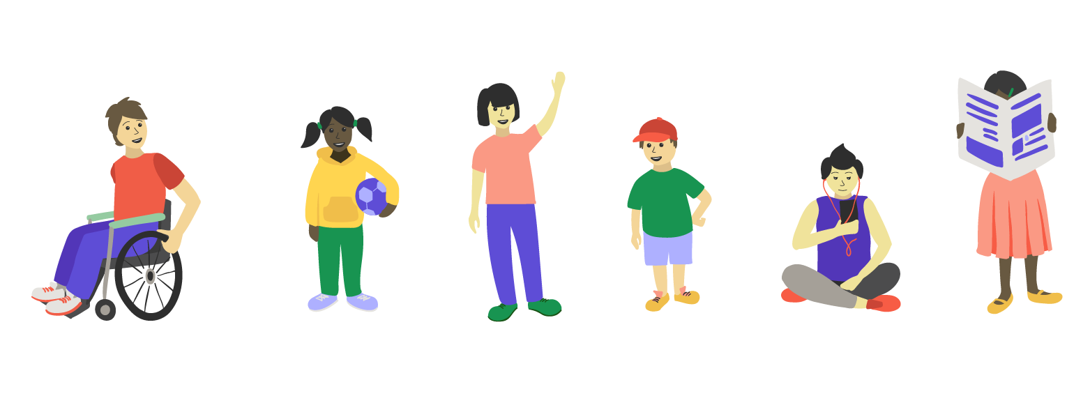
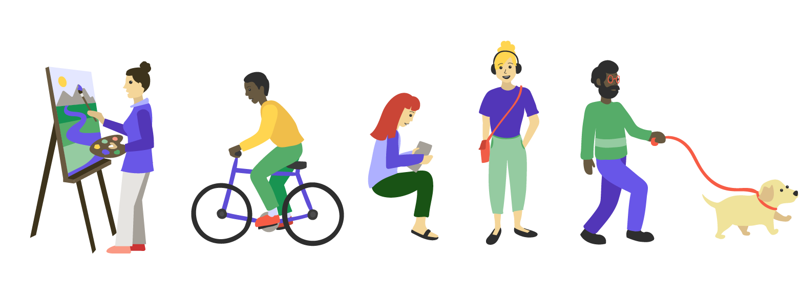
Illustrations
Aide Canada’s illustrations are organic and modern in shape with no severe angles. The primary colour of purple is always represented to maintain its prominence and and to tie visuals together. Their illustrations represent the vibrant and diverse world of autism and intellectual disabilities.
With that in mind illustrations had to be made friendly but not too playful and contain a diverse set of gazes, representations of sex, age, size, ethnicity, religion, disability, sexual orientation, gender identity and expression or family status.