First-mile Product
Experience
UX research & Design-
EMPLOYER
Tradeshift
ROLE
Experience & Product Design
Tradeshift had a strong suite of financial and accounting apps for procurement, invoices, payments, receipts, marketplace orders and financing. But without one clear place to start, the experience felt fragmented.
Our aim was simple: create one cohesive front door that unlocked the suite’s full potential, carried document context across apps, and delivered unprecedented value by matching the diverse customer needs, not the product org chart.

Background
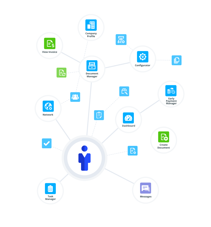
Tradeshift’s product organization was structured vertically in the following teams ‘Buy’ (procurement), “Pay” (Invoicing), “Cash” (financing) and “Go” (quick payment). Individual teams were incentivized to build deep functionality within their specific product lanes. However, financial workflows do not fit these product boundaries. For example, documents such as invoices, purchase orders, and goods receipts traverse the landscape.
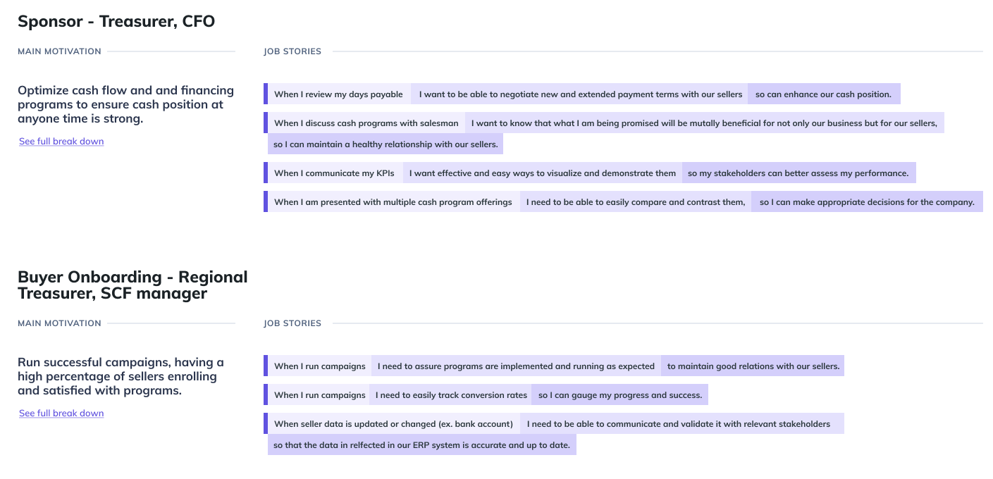
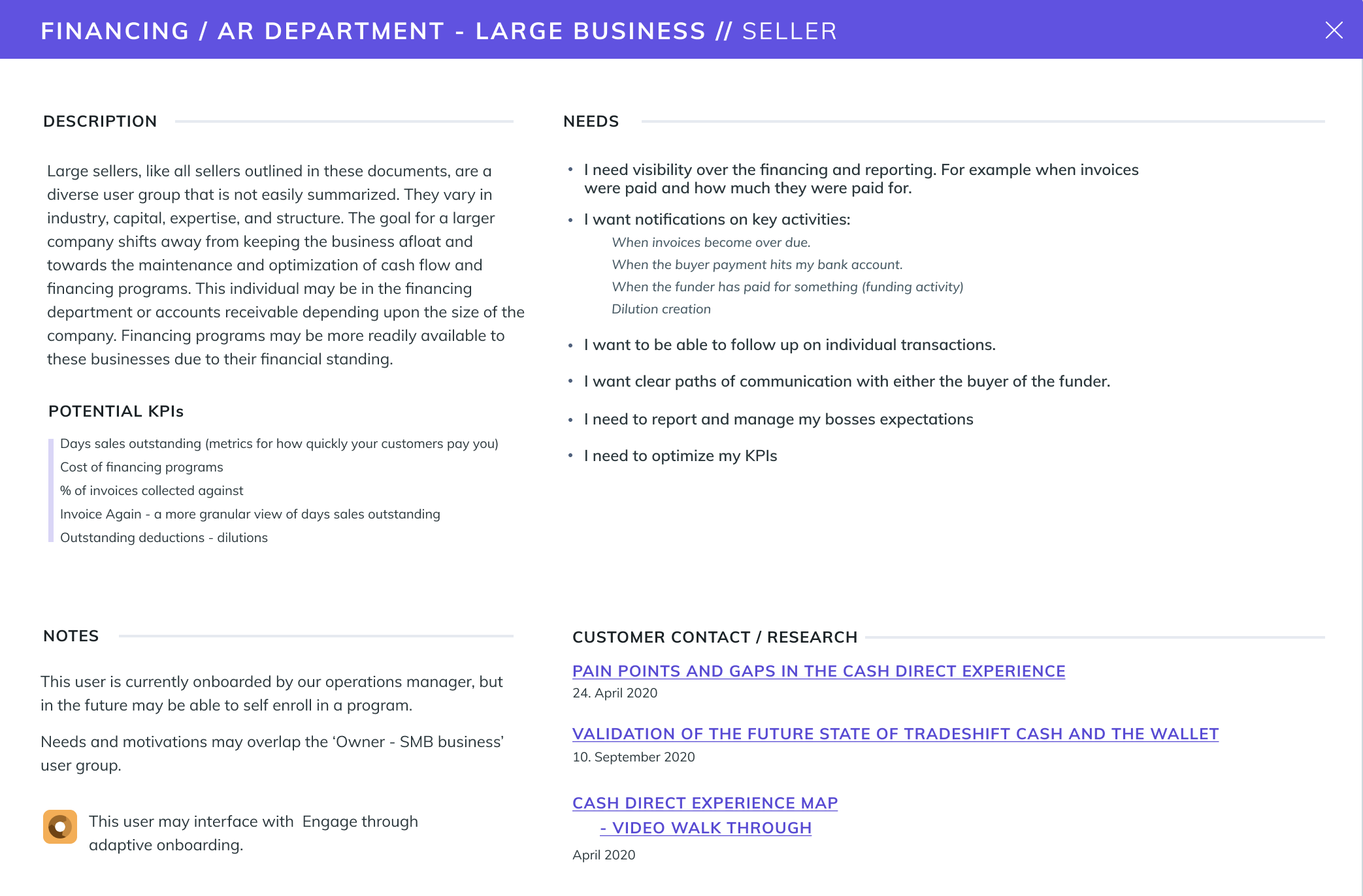
My mandate was to bridge these silos and create an experience that better reflected customer needs. I aligned embedded design teams around provisional personas and job stories to map “First mile” workflows. This process identified exactly how users initiate complex transactions and proved the need for a horizontal layer. We designed “Home” to aggregate these entry points and pass documents across apps with ease.
Kick off
Validating with Data
We audited quarterly NPS data and found the platform’s biggest weakness was findability, not functionality. Feedback clustered under UX and Training, citing “too many clicks” and “lack of guidance.” This confirmed a high barrier to entry: the fragmented architecture prevented users from reaching the tools they needed.
Defining a user-centric “First Mile”
Data showed users struggled not just to navigate the ecosystem but to understand it. I aligned teams around the “First Mile,” the critical post-login moment for establishing context. We co-created provisional personas by crafting job-stories based on digital literacy and intent, identifying specific experience gaps.


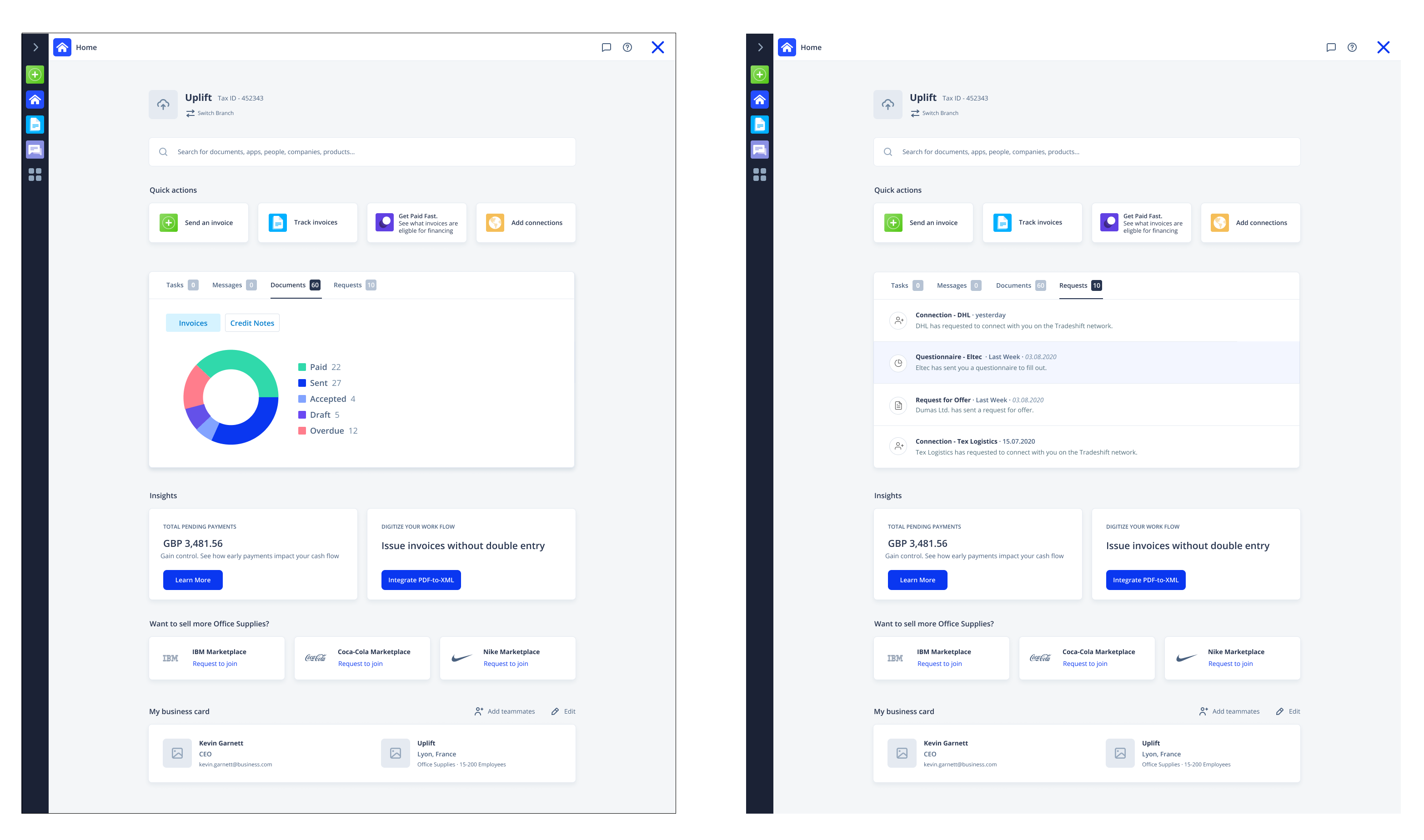
Designing the “Front Door”
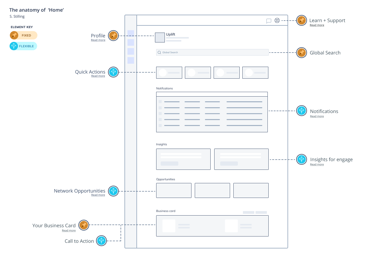
We synthesized diverse persona needs into a single, modular Home schematic. By balancing fixed orientation markers with flexible widget zones, the design adapts to the user, whether an AP clerk or a supply chain manager. This created a centralized launchpad that reduced time-to-task for customers while helping product teams meet their specific growth KPIs.
Build
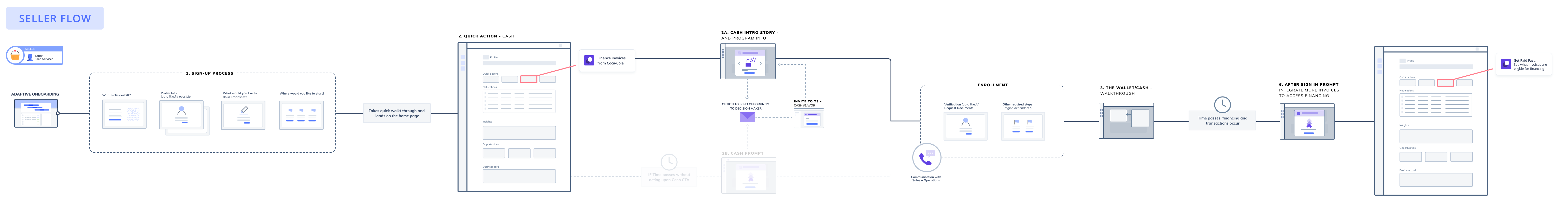
Designing prototypes for implementation
We advanced from wireframes to high-fidelity prototypes using a modular widget system. I worked with the vertical product teams to design specific “cards” for their apps, ensuring that critical documents, such as pending invoices and purchase orders, surfaced immediately on the dashboard. This validated that the unified “Front Door” could effectively aggregate diverse workflows.